Tuesday, December 1, 2009

why do people make art?

i think that people make are to express there thoughts and feelings in a non-verbal way. its a way to let out how your feeling and not keep everything bottled up inside you. its just a good way to tell a story without having to say a single word, because some people in the past didn't have written languages so they had no way of telling stories and history in any other way but verbally, which can be changed and/or easily forgotten. by making drawing, paintings and art it was a way to remember and document that past and present in a way thats both helpful and beautiful. people also just make are because they love to and because it can help relax you sometimes. art is just something fun to do to keep yourself busy and occupied but the end results can be much more then anyone thought that they would ever be.

Saturday, November 21, 2009

reflecting on the 4 hour project

it took me a pretty long time to figure out what i wanted to do for my 4 hour project. everything i thought of at first just wasn't possible at the time or i quickly lost interest in it. i finally found a picture of a sunflower on the internet and i started to draw it and when i finished it looked really plain to me. ms. roberts helped me by giving me the idea to keep the "floweriness" of it but make it bigger and unrealistic. i ended up covering the entire page with flower petals and i cut out the petals from the picture of the sunflower i drew and glued those on top of some petals along with origami paper i had. i then outlined the original flower that i drew in black marker. this project was a little more difficult for me mostly because i just couldn't think of an idea that i liked in the beginning and it was hard for me to start, but once i got an idea that i liked it was easy for me to get into the project and start working.

Monday, November 9, 2009

book project... process and planning

the story is supposed to be about a man in the army who crashes and ends up in the hospital and then he becomes depressed. then this little girl who's dad is in the army and she lives there as well meets him and cheers him up and then he decides to leave the army because she showed him that he would be happier outside of it.
its going alright. i've had a lot of trouble trying to get the girl that i have to look younger, smaller and stand up because she is older and riding a bike in my original picture. also trying to get the man to look sad and hurt because he is walking and smiling in the original picture. i'm mostly just having trouble trying to manipulate the people to look how i want them to in my story.

Thursday, November 5, 2009

drawing the human figure from the inside out

today we had to draw 3 people and they all posed in different way. i had the back to one of them who was standing up, the knees to another who was lying down and the front to the last one who was also standing up. the goals for today were to get the whole body in the picture and have it reflect what the persons pose was and also to work from the center 0f the body outwards. i think i mostly achieved these goals i always started from the hips and that made it a lot easier to make the rest of the body in proportion. the most difficult part was after finishing the general shape of the body, making the details like the face, hair and clothes, over all taking away the look of a scribbly sketch and making it actually look like a person.

Thursday, October 29, 2009

shades of gray

today we made charcoal drawings of a table set up with a few objects on it. we had to draw it in black and white only and we started out by making the entire piece of paper we had gray. then we erased and lightened of darkened parts of the picture to make it more realistic. i think the point of today was to learn how to use shadow and brightness to show how something looks instead of just using color. i think i achieved these goals pretty well because i think on my picture you could see what each item was and that they had different shadows and texture to them. some of the difficulties were that the charcoal kept rubbing off of where i wanted it and that i had to add shadow and fill in all the empty spaces so it didnt just look like lines that i drew but like actual objects.

Monday, October 26, 2009

studying nighthawks

Nighthawks by Edward Hopper made in 1942
he painted it with oil paint on a 30 x 60 canvas
Edward Hopper is from the US and he painted mainly in new york.

2. the painting looks like it is a dinner in about the era that it was painted in. i see four people and three of them are costumers sitting at the counter and one is the person who works there behind the counter. it looks pretty late at night and all the people there look kind of tired to me.

3. Edward Hopper is a painter for new york. he studied under Robert Henri, who was a a member of the Ashcan School of painters. they mainly focused on the gritty realities of city living and life. this painting was inspired by "a restaurant on New York’s Greenwich Avenue where two streets meet." that dinner is now gone but this painting is a timeless reminder especially because of the lack of narrative in the painting itself, it could really be in any location. the painting shows three people lost in their own thoughts. although hopper says that he didnt purposefully add symbols of isolation and emptiness to his painting. though he did say that he many have, "unconsciously, probably, I was painting the loneliness of a large city" in nighthawks.

4. hopper uses contrast to draw your eye to the scene with the people by making the outside very dark and without much color and the inside very bight with lot of light. also the green line at the bottom of the windowsill kind of acts like a leading line, the artist shows you where he wants you to look from and with that line he would want you to look from the man working there to the left at the rest of the painting. the painting is also pretty balanced, its more or less asymmetrical but it is balanced because there are two people right next to each other and then there is one person on either side of those two people. there is also a little repetition going on, near the right side of the painting there two silver things (coffee?) and they are pretty big and seem to be exactly alike.

Saturday, October 24, 2009

finding images that are blanced

<-- this is a radial symmetrical image.
<-- this is an asymmetrical image. <-- this is an approximately symmetrical image.

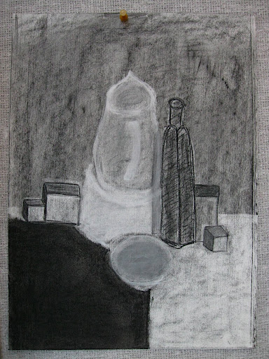
<- - this is a symmetrical image.

Tuesday, October 20, 2009

the principles of design

The Principles of Design - a set of rules that helps artist organize shapes, lines, colors or whatever they are working with.

Balance - is when the visual "weight" of an artwork feels equally distributed. the types of balance are...
Symmetry - if you draw a line down the middle of a picture its the same on the left as it is on the right.
Approximately Symmetrical - almost the same on both the left and the right side of the picture but there is some small differences.
Asymmetry - the opposite of symmetry.
Radial - where ever you draw a straight line through a picture its the same on both sides of the line, no matter where you draw the line.

Emphasis - 3 main ways artists create emphasis are, placement, contrast and grouping. artist think about where they place lines, shapes and color so they know where they are directing your attention when you look at the painting. when an artist decides to put a bunch of objects around the object they want you to have your attention on, they group things around it.

Rhythm & Movement - is a how the artist guides the viewer though the work of art. the leading ways to create rhythm and movement are...
Repetition- way to use it to lead people through a painting are, same elements, alternating elements and progression (the element is repeated but changing)
Leading Lines- where there is one or more lines that connect is some way in the painting and it leads you through the painting the way the artist wants you to.
Implied Movement- lets the artist make you believe that the piece of art is moving or was moving, that there was some kind of movement going on.
Optical Movement- it tricks you eye into thinking that the art is moving even though it is not
Actual Movement- literal movement, art that really moves.

Proportion - is size relationships of the parts of the work of art or the whole thing, when you think about proportion in your work you think about it for how it will look but also to create a story. ways to do this are colors, shapes and forms.

Unity - a felling that everything in the pictures works together. that if something was taken out the picture wouldn't be complete.

Variety - differences, adding something to make the picture more interesting, less boring.

Monday, October 19, 2009

reflecting at mid-term

this term of art principles we have mainly worked on the collaborative drawing, pour paintings, line story and found object sculptures. all of these activities have helped me understand myself as an artist better. at the beginning of the term we made a list of what an artist should be and i think i have become better at some of the things on that list, like being flexible and willing to change your art and "go with the flow," also being creative and letting things that you wouldn't normally think about using as art part of your art work. some of the things that helped me with those two thing specifically were the found object sculpture and the collaborative drawing. i think that i have improved in most most of the categories on the rubric that we filled out in class compared to the beginning of the term over all.

reflecting on found object sculptures

i began with this sculpture by really just looking at the materials i had and seeing that many of them were circles. there really wasn't something specifically that my sculpture was supposed to look like, it was more of an abstract thing. there also wasn't one thing in particular that inspired me to start this sculpture it was really seeing all of my objects next to each other. i just really liked how all the different colors and sizes of the circles looked together and thats really how it started to come about. my didn't really completely meet all the expectations because it doesn't really look like anything recognizable. i think it is still an interesting sculpture made of found objects even if it really doesn't resemble anything. i could have made it so it looks like something but then it wouldn't have ended being the same type of thing.

Thursday, October 15, 2009

what's in the sack?

today we had to draw a number of items that were in bags and show that they are all different shaped and textures while also showing that they were in bags. we could only use charcoal and an eraser. the goals for today were to draw from general shapes to specific shapes and to make sure that you could tell that every object had a different shape and texture. i think i achieved these goals pretty well because we had a box and a bag full of water and in my drawing the box had shape edges and and corners where as the bag of water was very round and flowy. the chalenges were getting the textures to come across in the drawing because all we had was charcoal and it was difficult to get textures and shadows correctly with just that.

Thursday, October 8, 2009

the changing still life

today we were drawing a still life with charcoal but the still life kept changing. items would be removed or new items would be put into the still life. in order to keep the still life looking like the set up i had to constantly be erasing item because they would either be taken away or another item would be added and it would cover or overlap the old item. also i had to draw many new things when ever something was added. and i had to move very quickly because near the end of the drawing time the items started to get added and taken away even faster then before. also a big thing was that u couldn't get too attached to the drawings or be too concerned with how it looked and if there were smudges and things like that.

Tuesday, October 6, 2009

the potential of found objects

typically when creating a sculpture out of found objects an artist will pick something that is around the same shape. like in the picture of the dog sculpture the god head is made out of a lamp but it looks like the snout of a dog. the sculpture of the heart that is made out of the jug like container is shaped more or less like a heart would be in real life. also color could be a reason an object was chosen, like in the cow sculpture although cows are not yellow, red and white, there typically is white where the white is placed on the cow in this sculpture. also in the bird sculpture the pieces look like feathers but they are also a color that a bird could be in real life.

Monday, October 5, 2009

reflecting on my first critique

the critique i got was that i should add more color and more lines to my drawing, but almost everyone in my group got what was drawing was supposed to show(which was people watching war happening and not doing anything about it). it felt fine to get critique from my classmates because they were very conscious about how they critiqued my drawing and were sure not to be mean about it, but they still gave me critique that i could use to improve my drawing with.

Sunday, October 4, 2009

the work of ingrid calame

ingrid calame's work does seem familiar because it is sort of like what we have been doing. she doesn't know how her drawings will end up looking because she is tracing stains and then layering them and seeing as she has no control over what the stains will look like she is doesn't have full control over how the piece will end up looking, just like we haven't had complete control. ingrid calame is an artist who traces stains and marks and then layers them over each other and then paints in the shapes and forms found in the drawing. she makes her paintings like that because when she was younger she wanted to make maps of the world and even though her drawings aren't really maps they are maps of what she sees in the paintings.
ingrid_calame_cohan-719070.jpgthat is a painting of ingrid calame's to the left. i like it because of the colors it uses, it has mostly blue greenish colors but there are little pops of bright colors that don't exactly match with the rest and i really like how that looks. i also like how all the shapes over lap under and over each other, it gives the piece depth, like it sort of looks like if you were to walk straight into it you could walk pretty far. Lastly i like all the different thickness of shapes. there are some very thick large lines and shapes and also some very small and thin lines and shapes and i really enjoy how they all come together to make a beautiful interesting piece of artwork.

Sunday, September 27, 2009

reflecting on the first full week

the four projects that we did this week were, describing a work of art, collaborative drawing, pour paintings and mapping the still life. these all related to each other because in each case we couldn't do things the way we normally would and we could never really be sure how it would turn out in the end. in each project we didn't complete control in one way or another. in the describing art you could never be sure how the other person would interoperate what you wrote. in collaborative drawing someone else may not have seen the same thing in the picture as you did. in pour paintings the paint really did what ever it wanted. lastly in mapping the still life you couldn't just draw what you saw like you would normally you had to change this around. 

Thursday, September 24, 2009

re-visiting observation/description activity

What parts of their drawing look like the actual painting?
the skeleton on the top of the bed was the only thing that kind of looked like the real painting and the back round clouds looked like the painting too, sort of.

What was missed? What parts did they not get and why?
the way the bad is sort of like a bunk bed didn't make it into the drawing and the lady sleeping in the bottom part of the bed. those things probably didn't make it into the painting because i wasn't descriptive enough or i didn't choose the right words to describe what was going on.

What would you do differently if you were to do this activity again?

i would be more desciptive and make sure to go into detail about everything in the painting and what view the painting is being drawn from. 

Wednesday, September 23, 2009

re-visiting my pour painting

Imagery in the pour:
1. fireworks
2. a shoe
3. the Eiffle tower
4. peacock feathers
5. a snake
6. car (station wagon)
7. a dogs head
8. ants walking in a line

Tuesday, September 22, 2009

Giving up control: Pours

today we did painting where we didn't know how the paint was going to look when it was on the paper because we poured it on. my partner was Lexie. our first painting was yellow and red and we tried to sort of splatter it on the paper. we liked how that looked so we did that for our next 2 paintings which were purple and blue and then black and green. it felt kinda cool to not really know where the painting was going to go and i really liked the end result.

Monday, September 21, 2009

collaborative drawing

it felt very different having other people work on my art. it didn't exactly go in the direction i was thinking but then again i was just sort of doing a random abstract art drawing. after i went and painted on other people drawings i can back to mine and it was really weird... i had to paint over a few things that i just thought didn't fit at all. but in the end it was ok and nothing went horribly wrong. but if i was doing a piece of art i cared more about i definitely would not want other people working on it as well.

Friday, September 18, 2009

post 2

What makes someone an artist? (An artist is someone who...)
Someone who is creative and expresses themselves through painting, drawing, photography, writing and any other type of art, and is not afraid to share there opinions with the world through something other then words.

What does it mean to be creative? (To be creative is to...)
To be creative is to just use your imagination and express yourself openly to the world.

Describe at least 3 or 4 things an artist needs to be creative and productive. (An artist needs...)
An artist need materials to work with, a good space to work in and something to inspire them.

Monday, September 14, 2009

1st Post

zoom3.ms.jpg

Side Lecture at the Metropolitan Museum

Max Weber

1961


First Impressions:

I really like the colors and shapes in this painting.  I think it kind of looks like its reflecting off it self in the painting.