Monday, January 4, 2010

reflecting on self-portrait project

i shared my general idea for my project which was to show my culture represented as the heart in my drawing of a hands and have that inside something was supposed to represent (some what) my mind. they didn't really react much because most of my project isn't put together and so it was more me explaining to them then anything else. since i can't find the drawing of my hands that i have been working on for pretty much all the past classes if i have to redraw that it will probably take 3 or 4 classes. then i still have to make the mold of the heart with mr. brooks and i'm not quite sure how many classes that would take. also lastly i have to write the words into the thought bubble but i can't really accurately size it until i finish the hands and heart.

Tuesday, December 1, 2009

why do people make art?

i think that people make are to express there thoughts and feelings in a non-verbal way. its a way to let out how your feeling and not keep everything bottled up inside you. its just a good way to tell a story without having to say a single word, because some people in the past didn't have written languages so they had no way of telling stories and history in any other way but verbally, which can be changed and/or easily forgotten. by making drawing, paintings and art it was a way to remember and document that past and present in a way thats both helpful and beautiful. people also just make are because they love to and because it can help relax you sometimes. art is just something fun to do to keep yourself busy and occupied but the end results can be much more then anyone thought that they would ever be.

Saturday, November 21, 2009

reflecting on the 4 hour project

it took me a pretty long time to figure out what i wanted to do for my 4 hour project. everything i thought of at first just wasn't possible at the time or i quickly lost interest in it. i finally found a picture of a sunflower on the internet and i started to draw it and when i finished it looked really plain to me. ms. roberts helped me by giving me the idea to keep the "floweriness" of it but make it bigger and unrealistic. i ended up covering the entire page with flower petals and i cut out the petals from the picture of the sunflower i drew and glued those on top of some petals along with origami paper i had. i then outlined the original flower that i drew in black marker. this project was a little more difficult for me mostly because i just couldn't think of an idea that i liked in the beginning and it was hard for me to start, but once i got an idea that i liked it was easy for me to get into the project and start working.

Monday, November 9, 2009

book project... process and planning

the story is supposed to be about a man in the army who crashes and ends up in the hospital and then he becomes depressed. then this little girl who's dad is in the army and she lives there as well meets him and cheers him up and then he decides to leave the army because she showed him that he would be happier outside of it.
its going alright. i've had a lot of trouble trying to get the girl that i have to look younger, smaller and stand up because she is older and riding a bike in my original picture. also trying to get the man to look sad and hurt because he is walking and smiling in the original picture. i'm mostly just having trouble trying to manipulate the people to look how i want them to in my story.

Thursday, November 5, 2009

drawing the human figure from the inside out

today we had to draw 3 people and they all posed in different way. i had the back to one of them who was standing up, the knees to another who was lying down and the front to the last one who was also standing up. the goals for today were to get the whole body in the picture and have it reflect what the persons pose was and also to work from the center 0f the body outwards. i think i mostly achieved these goals i always started from the hips and that made it a lot easier to make the rest of the body in proportion. the most difficult part was after finishing the general shape of the body, making the details like the face, hair and clothes, over all taking away the look of a scribbly sketch and making it actually look like a person.

Thursday, October 29, 2009

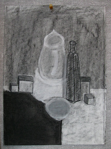
shades of gray

today we made charcoal drawings of a table set up with a few objects on it. we had to draw it in black and white only and we started out by making the entire piece of paper we had gray. then we erased and lightened of darkened parts of the picture to make it more realistic. i think the point of today was to learn how to use shadow and brightness to show how something looks instead of just using color. i think i achieved these goals pretty well because i think on my picture you could see what each item was and that they had different shadows and texture to them. some of the difficulties were that the charcoal kept rubbing off of where i wanted it and that i had to add shadow and fill in all the empty spaces so it didnt just look like lines that i drew but like actual objects.

Monday, October 26, 2009

studying nighthawks

Nighthawks by Edward Hopper made in 1942
he painted it with oil paint on a 30 x 60 canvas
Edward Hopper is from the US and he painted mainly in new york.

2. the painting looks like it is a dinner in about the era that it was painted in. i see four people and three of them are costumers sitting at the counter and one is the person who works there behind the counter. it looks pretty late at night and all the people there look kind of tired to me.

3. Edward Hopper is a painter for new york. he studied under Robert Henri, who was a a member of the Ashcan School of painters. they mainly focused on the gritty realities of city living and life. this painting was inspired by "a restaurant on New York’s Greenwich Avenue where two streets meet." that dinner is now gone but this painting is a timeless reminder especially because of the lack of narrative in the painting itself, it could really be in any location. the painting shows three people lost in their own thoughts. although hopper says that he didnt purposefully add symbols of isolation and emptiness to his painting. though he did say that he many have, "unconsciously, probably, I was painting the loneliness of a large city" in nighthawks.

4. hopper uses contrast to draw your eye to the scene with the people by making the outside very dark and without much color and the inside very bight with lot of light. also the green line at the bottom of the windowsill kind of acts like a leading line, the artist shows you where he wants you to look from and with that line he would want you to look from the man working there to the left at the rest of the painting. the painting is also pretty balanced, its more or less asymmetrical but it is balanced because there are two people right next to each other and then there is one person on either side of those two people. there is also a little repetition going on, near the right side of the painting there two silver things (coffee?) and they are pretty big and seem to be exactly alike.